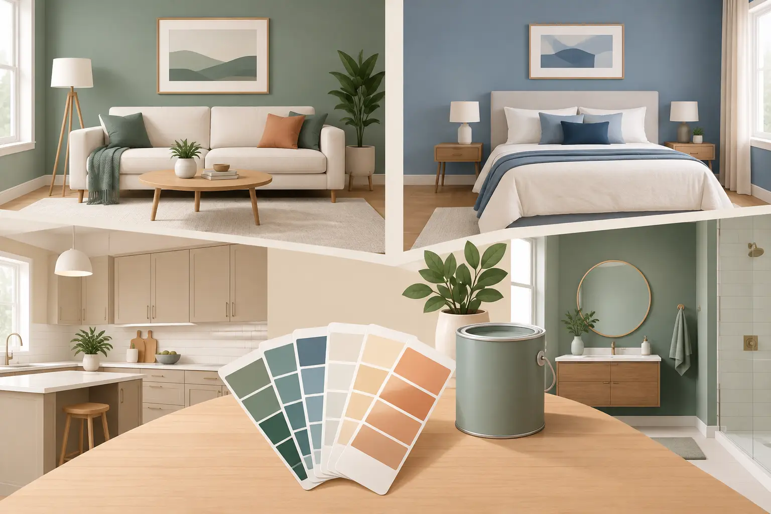
A paint color that looks composed in a sunlit front room can turn flat, green, or unexpectedly warm in the adjoining hall. That is why homeowners who want to match paint colours throughout a home should begin with light, fixed finishes, and sightlines - not a fan deck viewed under store lighting. A coordinated result is less about choosing one fashionable neutral and more about controlling how every surface reads from room to room.
For a premium repaint, color matching is part of the finish system. It affects where ceilings stop and walls begin, how hand-cut lines appear against trim, whether cabinetry feels intentional, and whether an exterior sits properly beside stone, brick, and roofing. The right process protects the investment in meticulous prep and high-quality application.
Start With What Cannot Change
Before selecting paint, identify the finishes that will remain in place. Flooring, countertops, tile, fireplace stone, stained millwork, brick, and roof shingles all carry undertones. Those undertones set the boundaries for the palette more reliably than a small paint chip.
A gray floor may lean blue, violet, green, or beige. White marble can contain cool gray veining or a noticeably creamy background. Even materials described as neutral are rarely neutral in practice. Painting walls in the wrong white or gray can make these fixed elements look yellowed, pink, or dull by comparison.
In a renovation or new build, request large samples before finalizing adjacent materials. For an existing home, bring samples into the room rather than relying on photos. A phone camera adjusts white balance automatically, so it is useful for reference but not for making final color decisions.
Match Paint Colors by Light, Not by Name
Paint names and fan-deck families can be helpful starting points, but they do not guarantee a match. Two colors with similar names may use different pigments, sheens, and bases. More importantly, a color behaves differently under changing light.
North-facing rooms in the Toronto area often receive cooler, bluish daylight. A pale gray can therefore read cooler and more severe than expected. South-facing rooms tend to receive warmer, stronger light and may make cream or beige tones appear more yellow. East-facing spaces are brighter and cooler in the morning, while west-facing rooms become warmer later in the day.
Artificial lighting changes the equation again. Warm LED lamps can pull a soft white toward cream. Cooler lamps can make an already cool gray feel clinical. If lighting will be replaced as part of the project, select the bulbs and fixtures first, then assess the paint samples under the finished lighting plan.
Use Large, Movable Samples
Apply sample paint to large primed boards rather than directly to every wall. Boards allow you to move the sample beside flooring, tile, cabinetry, and window treatments. They also prevent multiple sample patches from affecting the final wall surface.
View each sample in morning light, afternoon light, and evening light with interior fixtures on. Place it vertically, because paint reflects light differently on a wall than it does on a horizontal surface. Compare the sample beside white trim as well. A wall color that appears balanced alone can look too cool or too warm once framed by the selected trim color.
Build a Palette Around Sightlines
The most successful whole-home palettes are organized around what can be seen at one time. Stand in the entry, at the base of the stairs, and in the main living area. Note the rooms, hallways, and architectural openings that connect visually. These are the places where abrupt color shifts are most noticeable.
A common approach is to establish one principal wall color for connected public spaces, then vary depth in rooms that are more enclosed. This gives the home continuity without making every room identical. A dining room may use a deeper related neutral, for example, while the adjacent hall remains in the main color.
Undertone consistency matters more than exact color consistency. A soft warm white in one room and a greige with a compatible undertone in the next can feel calm and deliberate. A warm beige beside a blue-gray, however, often reads as a mistake unless the contrast is intentional and supported by furnishings or architectural features.
When using contrasting colors, give each one a defined role. A dark study, a mudroom cabinet finish, or a powder room can carry more saturation because it is a contained experience. It does not need to match every room. It does need to relate to the finishes and transitions immediately around it.
Keep Trim, Ceilings, and Doors Consistent Where It Counts
Trim is the visual framework of a house. In many homes, keeping baseboards, casings, doors, and crown molding in one consistent white creates order across different wall colors. It also makes touch-ups and future updates more manageable.
The exact white should be chosen with the wall palette, not after it. A bright, crisp white may suit a contemporary interior with cool finishes, while a softer white may better support warmer stone, oak, or traditional millwork. Pure white can look stark beside cream-toned materials. Conversely, a creamy trim can appear dated against cooler tile and clean-lined cabinetry.
Ceilings require the same attention. Standard ceiling white works well in many spaces, but it is not automatic. In rooms with warm walls, an overly cool ceiling can create a visible disconnect. In rooms with low ceilings, using a ceiling color close to the wall color can soften the transition and reduce contrast. This choice depends on ceiling height, natural light, and the level of architectural detail.
Sheen also affects the match. Higher sheens reflect more light and can make a color appear deeper or more active. A premium wall finish is often selected for washability and appearance, while trim may require a more durable, refined sheen. The sheen schedule should be considered before sampling, because a color on flat sample board will not read exactly like the same color on satin cabinetry.
Matching Existing Paint Requires More Than a Chip
When an existing paint color must be matched, a loose chip is useful but not always reliable. Age, sunlight, smoke, cooking residue, and previous touch-ups can all change the surface. Paint-store scanning tools provide a starting formula, not a guarantee of an invisible repair.
For the best result, remove a clean sample from an inconspicuous area, ideally at least one inch square. Avoid samples from walls exposed to direct sun or frequent cleaning. A professional can compare the sample to several adjusted formulas, then test the selected color in the actual space.
Even a precise formula can fail to disappear if the existing wall has faded unevenly or if the new paint has a different sheen. In those cases, painting the full wall from corner to corner is usually the cleanest solution. A small touch-up may be technically close but still flash under side light.
Cabinetry and Exterior Colors Need Their Own Process
Cabinet color must be evaluated against countertops, backsplash tile, hardware, and flooring at the same time. A cabinet white that looks crisp against a quartz sample may read too yellow once installed beside a cool backsplash. For refinishing, sample doors or large drawdowns should be viewed vertically and under the kitchen's working lights. The desired result is a factory-smooth finish that holds its color relationship from morning coffee through evening task lighting.
Exterior matching brings different variables: direct sun, shade, masonry, landscaping, neighboring homes, and local architectural character. Test colors on multiple elevations. A shade-facing side can make a mid-tone appear much darker, while a front elevation with strong afternoon sun can bleach out a pale color. Consider the body color alongside trim, front door, soffits, eaves, brick, and roof color before committing.
Avoid the Shortcuts That Create Expensive Corrections
The most common mistake is choosing from a tiny swatch without viewing it in the home. The next is selecting colors room by room with no sightline plan. Both can produce individually attractive rooms that feel disconnected as a whole.
Another issue is trying to solve a color problem with application alone. Clean walls, careful masking, and precise hand-cut lines are essential, but they cannot correct an undertone conflict or a finish selected under the wrong lighting. Color selection and paint execution must work together.
A disciplined painting team can help organize samples, confirm sheen transitions, and identify where full-wall repainting is necessary for a consistent match. On larger projects, this coordination should happen before final ordering and before furniture, fixtures, or cabinetry limit access to key surfaces.
The best palette does not call attention to itself at every doorway. It makes the home feel settled, gives each room a clear purpose, and continues to read well after the light changes. Before a final decision, live with the large samples for several days - that small pause is often what separates a close match from a finish that feels right for years.