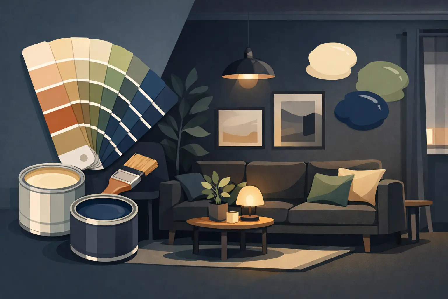
A dark room does not automatically need white paint. In fact, the wrong white can make a low-light room feel flat, cold, or faintly gray by mid-afternoon. The best colors for dark rooms are selected for the room's natural exposure, artificial lighting, adjacent finishes, and the feeling the space needs to create.
That requires more than choosing the palest swatch on a fan deck. Paint is a reflective finish, and its appearance changes with every available light source. A color that looks open and warm in a south-facing living room may look dull in a north-facing bedroom or overly yellow beneath warm LED bulbs. The objective is not always to make the room look brighter. It is to make it look intentional, balanced, and finished.
Start with the light the room actually receives
Before selecting a color, assess the quality of light rather than simply calling the space dark. A north-facing room receives cooler, indirect light for much of the day. East-facing rooms are brighter in the morning and can turn gray later on. West-facing rooms shift from subdued to warm as the day progresses. Interior rooms without windows depend almost entirely on lighting design.
This distinction matters because every paint color carries an undertone. A pale gray may lean blue, green, violet, or beige. A white may carry yellow, pink, gray, or green beneath its surface. In a dark room, those undertones become more apparent because there is less daylight to soften them.
Also look at what is fixed in the room. Hardwood flooring, stone, cabinetry, upholstery, tile, and even nearby paint colors all influence the result. A warm greige that works beside natural white oak may look muddy against cool marble. Proper color selection begins with those materials, not with a color name.
Best colors for dark rooms: the reliable directions
There is no single best paint color for every dark room, but several color families consistently perform well when selected with the right undertone and finish.
Soft warm whites
Warm whites are often the most dependable choice when the goal is to make a dark room feel cleaner and more open. The key is moderation. A white with a slight cream, beige, or soft gray base can prevent walls from reading icy or institutional in limited light.
Avoid assuming that a pure, high-brightness white will solve the problem. In a room with little natural light, stark white can take on a blue-gray cast and exaggerate shadows around trim, corners, and ceilings. A restrained off-white usually creates a more consistent finish from morning through evening.
Warm whites suit hallways, staircases, bedrooms, and main-floor living spaces where continuity matters. They also work well when trim is painted in a related but slightly cleaner white, creating definition without a hard visual break.
Light greige and putty neutrals
For many homes, a light greige is more forgiving than white. It gives the walls enough body to stand up to shadows while maintaining an understated, architectural look. Good greiges balance warm beige with a measured gray influence. They should not look brown in daylight or purple under artificial lighting.
Putty, mushroom, and soft taupe tones can be particularly effective in rooms with wood floors, warm metals, linen upholstery, or natural stone. These colors do not try to fight the darkness. Instead, they make it feel considered, which is often a better result in a den, dining room, or lower-level family space.
The trade-off is that neutral colors can look heavier than expected if they are too saturated. Test the exact shade at full scale before committing. A small chip will not reveal how a greige behaves across a full wall with changing light.
Muted greens with a warm base
Muted green can perform exceptionally well in dark rooms, especially when it leans olive, sage, or gray-green rather than mint. These colors have enough depth to feel deliberate, yet their connection to natural materials keeps them from becoming oppressive.
In a low-light study, dining room, or bedroom, an olive-leaning green can make woodwork, brass, antique furniture, and artwork feel more substantial. It is also a strong choice for rooms that are naturally shadowed by mature trees, where trying to force a bright white can create a mismatch between the interior and exterior environment.
Pay close attention to the green's undertone. Blue-green shades can become cold in north-facing rooms, while yellow-green shades may turn chartreuse beneath certain LEDs. A balanced, desaturated green is generally the safer direction.
Dusty blue and blue-gray
Blue is often dismissed for dark rooms because it can feel cool. That is only partly true. A dusty, complex blue with gray or a slight violet undertone can create a calm, tailored result, particularly in bedrooms, offices, and formal living rooms.
The room needs enough contrast to support it. Pair a deeper blue-gray with warm-white trim, medium-to-dark wood, aged brass, or soft cream textiles. If every surface is cool, the space can become severe. Paint color is only one part of the composition.
Lighter blue-grays require more care. In limited daylight, they may read nearly gray and lose the softness that made them appealing in the showroom. If the room already has cool light, select a blue with a warmer or slightly softened base.
Deep, enveloping colors
Sometimes the right move is to stop trying to make a dark room look light. Deep charcoal, rich navy, forest green, chocolate brown, or muted plum can turn a dim room into a space with presence. This approach works particularly well in powder rooms, libraries, media rooms, dining rooms, and bedrooms where atmosphere matters more than apparent square footage.
A dark color does not necessarily make a dark room feel smaller. Poor contrast and unfinished details do. When walls, trim, doors, and sometimes ceilings are painted in a coordinated deep tone, the eye stops measuring every edge. The result can feel quieter and more expansive than a patchwork of pale walls and stark white trim.
This approach demands disciplined execution. Deep shades show roller marks, flashing, missed cut lines, and poor drywall repair more readily than mid-tone colors. Meticulous prep, proper primer where required, and controlled application are not optional if the finish is meant to read as premium.
Paint sheen matters as much as color
In dark rooms, sheen changes how color behaves. Higher-sheen finishes reflect more light, but they also reveal wall imperfections and can create distracting glare from lamps or overhead fixtures. Flat and matte finishes absorb light, which often gives walls a refined, uniform appearance, but they may not be appropriate for every high-contact space.
For most residential walls, a quality matte or eggshell finish provides a measured balance. Matte is particularly effective on well-prepared walls in living rooms, bedrooms, and dining rooms because it minimizes surface irregularities. Eggshell offers slightly more durability for hallways and active family areas. Ceilings generally benefit from a flat finish to reduce glare and visually recede.
A premium paint system matters here. Better coatings typically offer more even coverage, stronger color retention, and a more consistent sheen, provided the surface has been properly prepared. No paint can hide a wall that has not been patched, sanded, primed, and inspected correctly.
Test colors at wall scale and under evening light
Sample boards are useful for narrowing options, but they are not enough for a final decision. Apply large test areas on more than one wall, ideally on the walls receiving the most and least light. Observe them in the morning, at midday, and after the room's regular lighting is on.
Use the actual bulbs planned for the room. Color temperature has a material effect: very warm bulbs can amplify yellow or red undertones, while cool bulbs can make white, gray, and blue paints feel stark. For living spaces, balanced warm lighting usually gives warm neutrals, greens, and deeper colors their most stable appearance.
Keep samples away from unpainted drywall patches and strong existing wall colors when possible. Those surrounding conditions can distort your perception. A professional color consultation is especially worthwhile when selecting paint around expensive flooring, custom cabinetry, stone, or large-scale millwork.
Give dark rooms a finish worth looking at
The best color choice will not compensate for inconsistent drywall repairs, uneven texture, or rushed cut lines. Dark rooms concentrate attention on the details: the transition at the ceiling, the line around a door casing, the consistency of the wall sheen, and the way paint holds across patched areas.
Choose a color that suits the room's real light, then give it the preparation and application standard it requires. A well-chosen warm neutral can make a dim hallway feel composed. A deep green can turn a shadowed dining room into the most memorable room in the house. The right answer is the one that looks settled in the space at every hour, not just impressive on a paint chip.