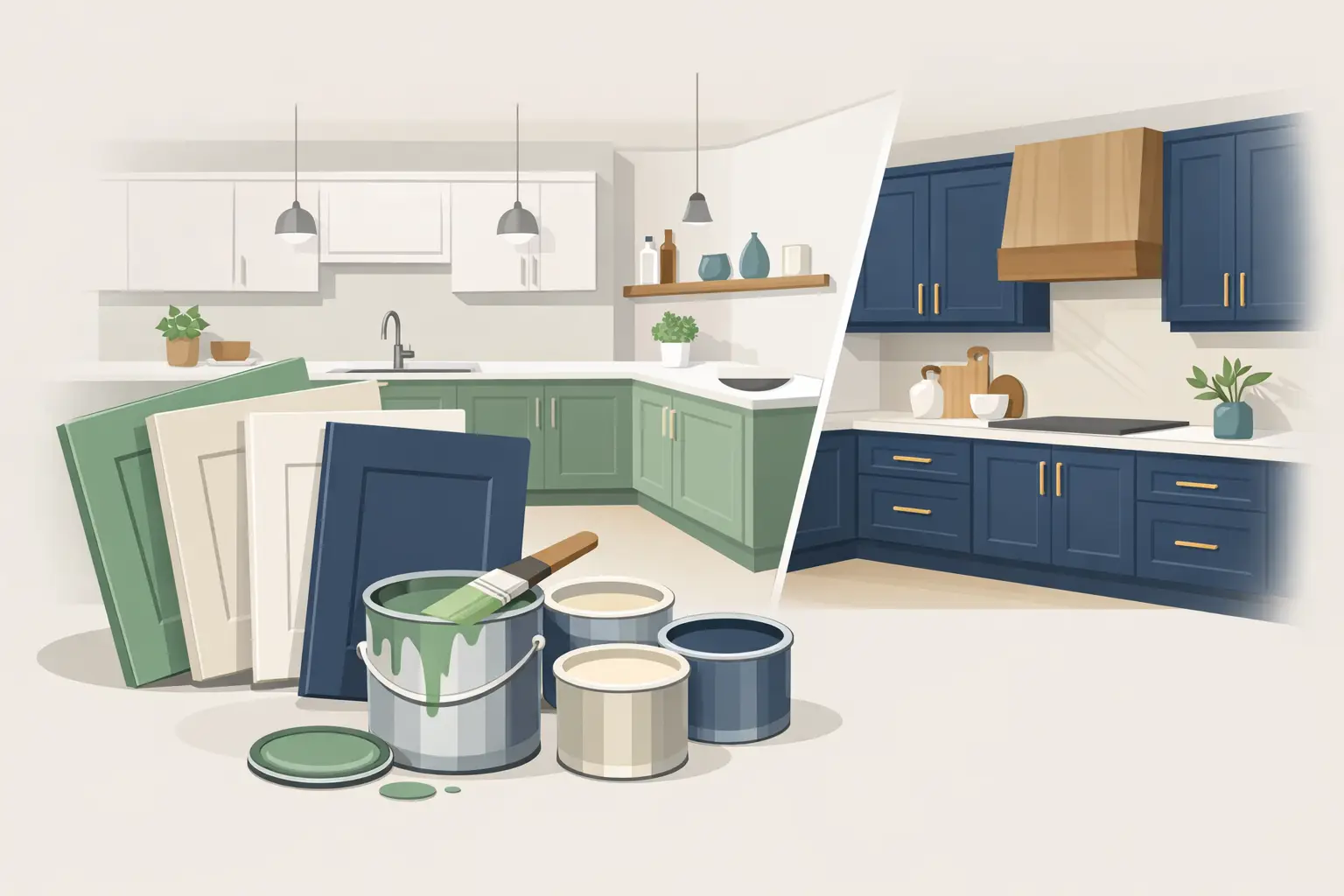
Cabinet color has more influence on a kitchen than most homeowners expect. It affects how stone reads, whether a room feels quiet or high-contrast, and how consistently the space holds together from morning daylight to evening artificial light. The top cabinet paint colors are not simply the shades currently circulating in design feeds. They are colors that suit the fixed finishes in the room, remain credible over time, and can support a factory-smooth result when the cabinet preparation and coating system are handled properly.
For a kitchen repaint, the right question is not, “What is the most popular color?” It is, “What color will still look intentional against this floor, countertop, backsplash, hardware, and light?” That distinction prevents expensive second thoughts.
Top Cabinet Paint Colors That Hold Up Well
Warm white
Warm white remains one of the most dependable cabinet choices for traditional, transitional, and contemporary homes. Unlike a stark, blue-white paint, a properly selected warm white carries a small amount of cream, beige, or gray. That undertone helps it sit comfortably beside natural oak, warm marble, brass hardware, and off-white backsplashes.
The trade-off is that white is unforgiving of poor prep. Door profiles, joints, nail repairs, and grain telegraphing are easier to see in a pale finish, particularly under under-cabinet lighting. It also shows cooking residue around pulls and lower doors more quickly than a mid-tone color. A durable cabinet enamel and careful cleaning routine make the maintenance manageable, but white cabinetry should be selected with clear expectations.
Soft greige and mushroom
For homeowners who want the brightness of an off-white kitchen without the visual maintenance of white, soft greige and mushroom tones are strong options. These shades bring enough depth to define cabinet boxes while still reflecting light through a smaller kitchen. They work especially well with honed stone, brushed nickel, aged brass, and medium-toned hardwood.
Undertone discipline matters here. A greige with a green cast can look flat beside rosy oak; one that leans pink can become noticeably warm next to cool gray quartz. Large painted sample boards should be viewed vertically beside the countertop, not laid flat on a table. Color changes considerably when it shares a plane with the room’s permanent finishes.
Deep green
Deep green cabinetry has moved beyond the trend category because it can feel architectural rather than decorative. Restrained olive, forest, and blackened green shades add depth without the hardness of black. They are particularly effective on a kitchen island, a pantry wall, or full cabinetry in a room with strong natural light.
Green depends heavily on lighting. North-facing rooms may pull a green cooler and grayer, while warm LEDs can make olive-based shades look more yellow. Before approval, evaluate the sample in daylight, under the kitchen’s installed lighting, and at night. A color that works at noon but becomes muddy after sunset is not the right selection for a heavily used kitchen.
Navy and softened blue-black
Navy remains a reliable choice when a homeowner wants contrast with restraint. The best cabinet navies are usually softened with gray or black rather than highly saturated. They pair well with white marble, pale quartz, unlacquered brass, polished nickel, and light oak floors, giving the room definition without overwhelming it.
A very dark blue can make a compact kitchen feel smaller if it is used on every cabinet surface. In that situation, use it on the island or lower cabinets and retain a lighter color on uppers. The same approach can create visual balance in a large open-plan kitchen where dark cabinetry needs to relate to adjacent living spaces.
Charcoal and near-black
Charcoal and near-black cabinet colors produce a tailored, high-end effect when the kitchen has adequate light and a clean design language. They are excellent with pale stone and simple slab or shaker doors. Compared with true black, charcoal often has more dimension and is more forgiving of dust, fingerprints, and minor surface variation.
These colors are not automatically low maintenance. Grease marks and dried water spots can still show on a dark, low-sheen door front, particularly near the range and sink. Proper degreasing before painting is essential, but so is selecting a finish that can be cleaned without burnishing or damaging the coating.
Natural muted blue
Muted blue works best when it behaves like a neutral. Think dusty blue-gray, softened slate, or an inky blue with enough gray to settle into the room. These colors suit coastal-influenced, classic, and updated traditional kitchens, especially where warm wood, limestone-look tile, or aged metal finishes are present.
Avoid choosing blue from a small chip alone. Bright blue undertones become much more obvious across a full bank of doors. A muted shade may look nearly gray on a swatch, then reveal its character once it covers the cabinetry. That is often desirable, provided it has been tested at scale first.
How to Choose Cabinet Paint Colors by Fixed Finish
Cabinet paint should usually be selected after the countertop, backsplash, flooring, and hardware are confirmed. These materials are costly and difficult to change. Paint is more flexible, but it still needs to coordinate with them precisely.
Start with the countertop. White marble and marble-look quartz can carry blue, gray, gold, taupe, or green veining. The cabinet color does not need to match that veining, but it should not fight it. A warm mushroom cabinet may suit gold or taupe movement beautifully, while a cool blue-gray can be more appropriate with crisp gray veining.
Next, assess the floor. Red oak, white oak, walnut, tile, and engineered flooring all change the temperature of the room. Warm floors generally need a cabinet color with enough warmth to avoid looking disconnected. Cooler floors can support cleaner whites, blue-grays, and charcoals. If the kitchen opens directly to another room, carry that view into the decision. Cabinetry should not look like it belongs to a separate house from the moment you step into the adjoining space.
Hardware is the finishing note, not the starting point. Brass can bring warmth to dark green, navy, mushroom, and warm white. Polished nickel is more versatile and typically supports cooler schemes. Matte black hardware creates stronger graphic contrast, which can be effective, though it makes door alignment and hand-cut lines more visually prominent.
Why Samples Must Be Tested in the Actual Kitchen
Paint decks are useful for narrowing a direction, not finalizing a color. Cabinet finishes have a broad, continuous surface area, and sheen changes the way color reflects light. A sample that appears balanced on a two-inch chip may look significantly darker, warmer, or cooler across twenty doors.
Paint at least two large sample boards in the proposed cabinet product and sheen. Place one near the window and one near the range or interior wall. Move them around the room over several days. Look at them beside the countertop, backsplash, and appliances, then under every light source used after dark.
This process also exposes a common issue in Toronto-area homes: mixed lighting temperatures. Daylight may read cool, while warm recessed lights, pendants, and under-cabinet LEDs each shift the cabinet color differently. A polished kitchen is not one that looks good only in one condition. It should read consistently across the day.
Color Is Only as Good as the Cabinet Finish
A premium cabinet repaint is a refinishing process, not a wall-painting exercise. Even the best color will look ordinary if it is applied over silicone, cooking residue, failed coatings, open joints, or poorly sanded profiles. The work begins with protection and removal or masking, followed by thorough cleaning, deglossing or sanding, repairs, bonding primer where required, and controlled application of a cabinet-grade coating.
Sheen should be selected deliberately. Satin is often the practical middle ground: it has enough reflectivity to feel finished and enough restraint to avoid highlighting every imperfection. Matte finishes can look elegant but may be less forgiving during cleaning. Higher-sheen finishes are durable and crisp, yet they expose substrate flaws, uneven spraying, and inconsistent surface prep.
Door condition matters as well. Thermofoil, laminate, previously painted wood, and solid wood each require different assessment and prep. If thermofoil is lifting or the underlying substrate is swollen, paint alone may not solve the problem. A professional review should establish whether refinishing is appropriate before a color is selected.
A More Considered Way to Use Color
Full-color cabinetry is not the only route. Many of the strongest kitchens use a darker island with lighter perimeter cabinets, or a muted color on lower cabinets with a warm white above. This approach can preserve brightness while adding depth, and it gives homeowners more latitude with a bolder shade.
For custom homes and major renovations, cabinet color should be reviewed alongside wall color early enough to avoid last-minute compromises. Walls that are too cool can make warm cabinetry look yellow; walls that are too warm can flatten a greige or gray-blue cabinet finish. The goal is quiet coordination, not exact matching.
The best cabinet color is the one that respects the room’s fixed materials, performs well in its real lighting, and is applied over meticulous prep. When those decisions are made carefully, the kitchen feels finished rather than merely repainted.