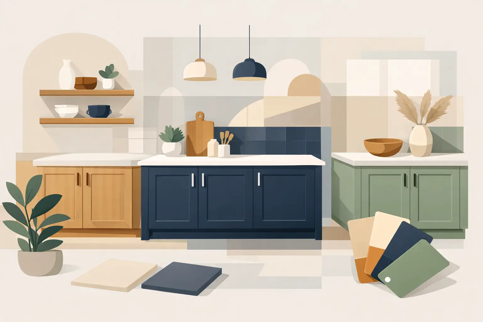
A cabinet color can look exceptional on a sample board and feel entirely different across a full kitchen. In Toronto and the GTA, where winter light, open-concept layouts, and substantial natural stone are common, kitchen cabinet colour trends need to be assessed as part of the whole room - not as a standalone paint decision.
The strongest direction is not toward novelty. It is toward warmth, depth, and finishes that remain composed under changing light. Homeowners are moving away from stark, blue-based whites and highly saturated statement colors in favor of cabinet palettes with more visual weight. The result is a kitchen that feels considered now without requiring another repaint when the next trend cycle changes.
Kitchen Cabinet Colour Trends Are Getting Warmer
For years, bright white cabinets were the default renovation choice. They remain appropriate in some homes, particularly where the architecture is traditional, the room has limited daylight, or surrounding finishes need a clean visual break. But the white cabinets currently holding up best are softened whites with a slight cream, beige, or gray undertone rather than sharp, clinical white.
This change is largely a response to the materials now common in higher-end kitchens. Honed stone, aged brass, white oak, warm porcelain, and natural flooring can make a cool white cabinet read disconnected. A warmer white provides contrast without fighting those finishes.
Undertone is the deciding factor. A white that appears neutral under showroom lighting may pull green, pink, or gray beside a countertop. Before committing, samples should be viewed vertically on the actual cabinet plane, beside the backsplash, flooring, hardware, and wall color. They should also be reviewed in morning daylight, evening light, and under the kitchen's installed fixtures.
Soft Greige and Mushroom Neutrals
Greige, mushroom, taupe, and putty-toned cabinets have become credible alternatives to white because they provide warmth without becoming overly decorative. They work particularly well in homes where the kitchen connects directly to a dining room, family room, or living space. Rather than creating a bright white block at the center of the plan, these shades allow cabinetry to sit more naturally within the architecture.
The trade-off is that neutral colors are less forgiving than they appear. A greige with too much gray can look flat on north-facing elevations. One with too much beige can turn yellow beside a cool marble or white quartz. Proper color selection depends on the fixed finishes and the quality of the light, not simply a color name.
Deep Greens and Blues Have Replaced the Statement Gray
Grounded colors are now being used with more restraint and more confidence. Deep olive, muted sage, forest green, smoky navy, and blue-green shades bring character to an island or a full cabinet run without the sharp visual impact of black.
Green has particular staying power because it connects well with both warm and cool materials. An olive-based green can sit comfortably with oak, brass, limestone, and creamy stone. A gray-green offers a more tailored look with nickel, stainless steel, and veined marble. The most successful greens are usually softened or earth-based rather than bright botanical shades.
Blue remains a strong option, especially for islands, pantry walls, or lower cabinets. The best versions are complex: charcoal navy, slate blue, or a subdued blue-black. Highly saturated navy can feel formal or heavy, especially when used across every cabinet in a kitchen with limited natural light.
For many homes, a two-tone approach is the right balance. Light upper cabinets preserve openness, while a darker island or lower perimeter adds structure. This can be especially effective in larger kitchens, where a single pale color may leave the room feeling visually unfinished.
Wood-Looking Warmth Is Influencing Painted Cabinets
Natural wood cabinetry has returned in a substantial way, particularly white oak and walnut. That does not mean painted cabinetry is losing relevance. It means paint colors are being selected to work alongside wood rather than compete with it.
Warm whites, soft clay tones, muted greens, and deep brown-black paints all pair well with natural grain. Cool blue-gray cabinets, by comparison, often create a split visual message next to warm oak. Where an existing kitchen includes wood flooring, ceiling beams, open shelving, or a wood island, the cabinet color should acknowledge that temperature.
Brown is also reappearing in carefully controlled applications. Espresso and red-toned stains can feel dated, but deep cocoa, tobacco, and softened umber paint colors can look refined when paired with simple door profiles and modern hardware. They are best suited to kitchens with good natural light or light stone surfaces that prevent the cabinetry from becoming too visually dense.
Black Cabinets Require the Right Conditions
Black cabinetry remains popular in design imagery, but it is not a universal answer. In a kitchen with generous windows, pale flooring, and light countertops, a softened black or charcoal can create an architectural, tailored finish. It can also be effective on an island, where the darker color grounds the room without reducing the perceived size of the perimeter.
In smaller or poorly lit kitchens, black can absorb detail. Door profiles become less visible, dust and fingerprints can be more apparent, and the room may feel closed in. A charcoal with a warm undertone, dark bronze, or blue-black often delivers similar depth with better livability.
The sheen matters as much as the color. A flat or matte cabinet finish can look sophisticated, but it is less practical on high-touch surfaces and more difficult to clean without marking. For most painted kitchen cabinets, a low-luster satin finish offers the right balance of washability, durability, and controlled reflection. A factory-smooth result also depends on the coating system and application method, not just the sheen selected.
Why Finish Quality Matters More Than Trend Forecasts
Cabinet painting is not comparable to painting a wall. Cabinet doors and frames receive daily contact, regular cleaning, heat, moisture, and impacts around handles and drawer pulls. A current color applied over poor preparation will fail quickly, while a well-prepared cabinet in a restrained color can hold its value for years.
The process should begin with a close assessment of the existing finish. Grease, silicone residue, worn clear coat, damaged edges, and previous touch-ups all need to be addressed before primer is applied. Doors and drawers require controlled removal, labeling, cleaning, sanding, and repair. The cabinet boxes need equally careful preparation, with masking that protects counters, floors, appliances, and adjacent finished areas.
For a durable result, the selected primer and topcoat must be compatible with the cabinet material and existing coating. Oak, maple, MDF, thermofoil, and previously painted doors each present different conditions. A professional crew will identify limitations early rather than promise a finish that the substrate cannot support.
Application also affects how a color reads. Brush marks, uneven sheen, debris in the coating, and inconsistent coverage are much more visible on dark colors and smooth modern doors. Sprayed doors, hand-cut lines on cabinet frames, protected work areas, and disciplined cure time are not cosmetic extras. They are part of producing a finish that looks intentional under close inspection.
Choosing a Color That Fits the Home
The best cabinet color is rarely chosen from a trend report alone. It should relate to the home's architecture, surrounding rooms, fixed finishes, and expected use. A historic home in Rosedale or Forest Hill may suit a warm ivory, heritage green, or deep tailored blue. A contemporary kitchen in Etobicoke or Leaside may benefit from mushroom-toned perimeter cabinets with a dark island and clean-lined hardware.
Resale should be considered, but it should not force every homeowner into white. If the kitchen is well designed and the color is nuanced, a deeper or warmer cabinet palette can feel more valuable than a generic finish. The safer choice is not always the palest one. It is the color that looks correct with the room's permanent elements and is executed to a high standard.
Before finalizing any color, approve large samples in the room and view them over several days. Test them beside the countertop, backsplash, floor, and hardware. Confirm the lighting temperature. Then select a coating system and preparation process designed for cabinetry rather than treating the project as a quick cosmetic update.
A kitchen should not look fashionable for one season and compromised by the next. The right cabinet color, supported by meticulous prep and a disciplined finish process, gives the room a quieter advantage: it continues to look right every time the light changes.